“My $1,600 photography advertising mistake” plus 1 more: Digital Photography School | |
Posted: 18 Jun 2011 12:19 PM PDT Why do we advertise? Most of us photographers are creatives. We’re looking to pull the business out of our creativity and make it pay us. What’s one thing the majority of creatives suffer with? Business sense. How’s that supposed to work, eh? We want to go into business but are too artsy fartsy to have a clue. Most people know one thing about business: you have to advertise. And for someone with a little money to spare starting up their business, splashing out on some advertising is often a dismal first move. We don’t like to sell ourselves, so taking out an ad or juicing up the balance on our Google or Facebook ads account seems to be the way to go if we want to avoid actually selling. Why didn’t my magazine ad work? I thought the magazine ad was a sure thing. I thought it was perfect because it went straight into the school bags and homes of my target market: people with children in a wealthy area. In retrospect, it didn’t work because:
If I were going to do a print ad again, I would have spent that money on many quarter-page ads and not one big whopping full-page ad. I would go into it knowing that I was building a reputation, getting my work in front of people’s eyes. I wouldn’t sit by the phone and wait for the work to roll in. The crash-and-burn disappointment from that mistake was a really hard lesson to learn. It hurt big time. It hurt my confidence and it hurt my finances. I’m still smarting from it even as I’m writing this. Ouch. How to advertise for sales, not just for recognition? You can’t get away from it. You have to SELL yourself. Save your money and hit the streets. This is what I do:
My $1,600 photography advertising mistake |
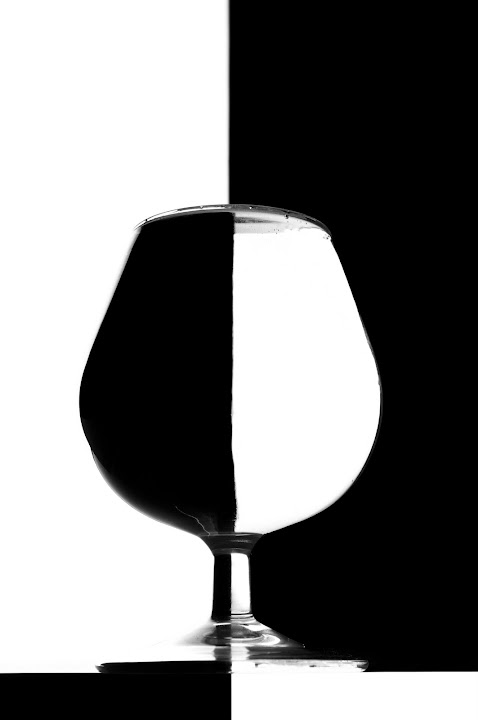
Posted: 18 Jun 2011 07:45 AM PDT Weekly AssignmentWe finished off our Symmetry Assignment this week, and we saw many different ways that we can find symmetry around us.Our winner this week was i speak in math’s black and white glass. This was a very clear example of symmetry in the way that the black mirrored the white and the way it was clearly split down the middle. This one had an almost graphical quality that stood out to us.  Our first runner up was shutterbugdeb’s barn image. The barn is so symmetrical it almost looks as if someone put a mirror in the shot. Even the top window with it’s angles is clearly symmetrical. This was also a good example of a black and white image that captured the tones nicely. And last, but not least was Cambyses‘ “Light at the end.” This was an interesting shot. In fact, it reminded us a bit of the Vitruvian Man” the way the arms are in the photo. This was an interesting way to include a human element into the symmetry assignment. We also started our Diagonal Lines Assignment this week. Diagonal lines are another compositional technique that can add interest to an image and help guide the eye through it. As always, a quick reminder of the rules. First, your photo must have been taken between 8-22 June 2011. Second, your photo must include the words “Diagonal Lines” and the date the picture was taken. Finally, your EXIF should be intact, and it’s helpful if you can include some of the main points such as camera, lens, aperture, shutter speed, ISO, etc. Next week our Horizontal Lines Assignment will be posted, but don’t forget you can start photographing now. Good luck everyone! Post from: Digital Photography School's Photography Tips. Check out our resources on Portrait Photography Tips, Travel Photography Tips and Understanding Digital Cameras. This Week in the Digital Photography School Forums (12-18 Jun ‘11) |
No comments:
Post a Comment